The goal of the site is to help skiers and snowboarders quickly and easily make informed decisions about where to go skiing or snowboarding. Our website compiles and presents the most pertinent information about all the resorts in the Pacific Northwest. This includes detailed information about the terrain, weather conditions, cost, and proximity of each resort to the user’s location.
Skiing and snowboarding are fun activities, and we believe that the process of booking a trip to a ski resort should be as well. Our website will make the search for ski resorts intuitive and informative so that users focus less on logistical obstacles and more on enjoying their trip.
Deliverables: user research report, persona, paper prototype, functional prototype, design specifications
Methods Employed: Storyboard, online survey, extreme user interview, persona, affinity diagram, paper prototyping, high-fidelity prototype
Role
Interaction Designer
Problem
Design Question
How might we enable a skiers/snowboarders to find a resort in the Pacific Northwest that best matches their criteria for terrain, proximity to their home, and conditions?
Survey
We created a ten-question online survey with targeted questions used to obtain the characteristics and perceptions that our stakeholders have when choosing a ski resort. We sent the survey to two separate groups. One group consisted of experienced skiers and snowboarders whom we knew personally. The members of the second group were referred to online forums frequented by experienced skiers and snowboarders.
We asked questions about experience level to make sure we are talking to experienced skiers and snowboarders as well as questions to determine if there were any people among them who were program coordinators.
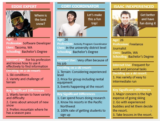
Persona
The stakeholders who have an interest in the web application are expert or experienced skiers and snowboarders and program coordinators. Program coordinators are people who are the decision makers and who bring a group together at the resort. After we conducted extreme user interviews with nine (9) participants, we created the three (3) persona shown below.
Affinity Diagram
We used the responses to the online survey and the interview questions regarding things that people liked, disliked, or wanted changed in the current process. Only the responses to the survey questions and interviews were used to derive the elements on the following affinity diagram.
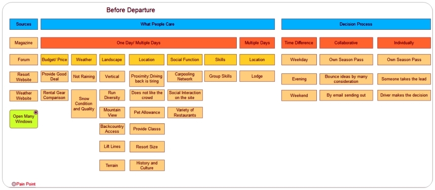
The elements of the affinity diagram led the team to develop several possible features that they could use in future discussions regarding implementation of the website.
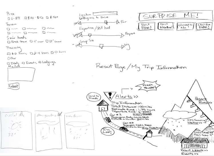
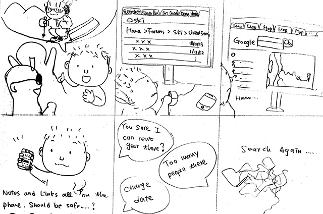
Paper Prototyping
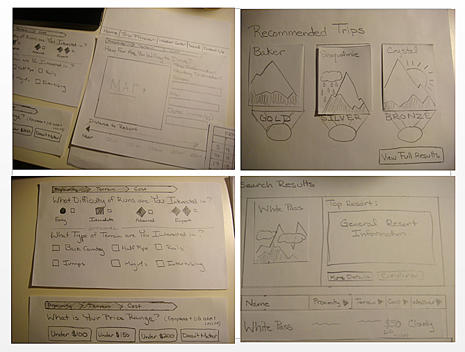
Testing Scenario
We used a paper prototype that would represent the screens of the web application.
We asked each of our participants to plan a skiing or snowboarding trip for the weekend that would include some of their friends. This scenario encouraged users to navigate from the first page (ski resort search) of the paper prototype to the last page (the ski resort trip plan). The three participants who tested our prototype managed to navigate to each page of the prototype even though they possessed a different combination of skills and knowledge relating to ski resorts in the area.
Results
The participants were able to navigate successfully through all of the pages of the paper prototype and were able to select a ski resort. A common theme among the participants was a mistrust of our recommendations regarding the selection of a ski resort. We wanted to show the recommendations first to help people find a resort faster without requiring them to review detailed information about each one. The participants considered this annoying. Without any supporting information, they did not understand how the recommendations were derived. The participants did not feel confident about the recommendations the prototype made and chose not to accept them. They actually ignored the recommendations and just chose the resort that they wanted visit.
Participants said they obtained the detailed information they wanted only after they had selected a ski resort which was too late in the process. Instead, they preferred to have the detailed information available at the beginning of the process, either to backup our recommendations or so they could choose a ski resort themselves.
Participants also expressed frustration and confusion regarding what certain controls would do in the web application. This problem occurred because of ambiguous labeling. For example, the participants did not understand the difference between the skip button and the next button used in the paper prototype (screens). We will use the results of the paper prototype testing to improve the web application.
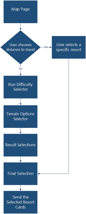
Site Structure and Navigation
Prototype
Built on Axure.
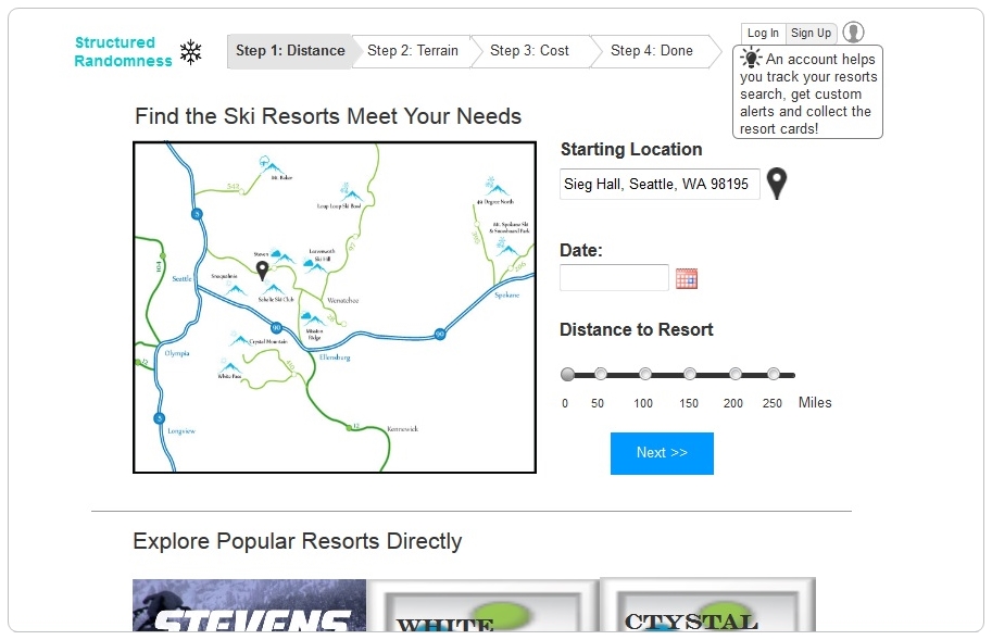
Visually it is a map which shows all the ski/snow resorts in the Pacific Northwest. The Map list/menu is highlight to show where the user is on the list/menu. The map list/menu is the homepage. The user will start with providing the zip and then indicate on the bottom the distance the user would want to drive. It is a scale representing an hour increment. Depending on the distance that the user wants to drive, the map will expand or reduce to better display the resorts within the user requested distance.
Questions that we focus on were:
- Why only show resorts in a certain distance range?
- Why allow a user to go to a resort card directly and skip the resort choosing process?
- Why allow the user to skip the terrain section?
- Why show different terrain options for the different terrain difficulties?
- Why the search result is formatted the way it is?
- Why display the final selection?
- Why have the information be sent via email?
- Do you need an email confirmation?
Our Next Step
What we found was there still some room to improve from our current design which will be on the next phrase.